Shinola
Overview—
Shinola is an e-commerce B2C brand that sells luxury leather goods ranging from watches, bags, and bicycles among other products.
I worked with Shinola through a business leadership experience internship program from Ross School of Business, University of Michigan.
Duration—
4 months internship
Jan - Apr 2020
What I did—
Project Manage, UX Design, Research
I was the sole UX designer on a website team comprised of 3 researchers. I was fortunate to own the problem and be responsible for determining the overall design and research direction of the project while collaborating with the stakeholders.
Worked with—
3 Researchers, Supervisor, Marketing Specialist, Director of E-commerce
Challenges
Discovery Phase
—
How might we encourage users to pass the homepage?
When the website team joined mid-January, the company was about to move into the dev site-building phase.
Prior to the transition, we quickly jumped into the discovery research phase to understand the current setup.
Site Analysis Phase
—
Short-term Goal:
How might we help users to discover more collections?
After launch and live test out the incorporated navigation bar and layout, we discovered key insights to build value for customers and businesses through heatmaps and competitive research.
We set our short-term goal as achieving a higher conversion rate.
Design Phase
—
Design Challenge:
How might we allow users to easily explore more products?
With collected data, as the designer, I focused on ideating and creating conceptual development of mid-fi screens of the homepage.
↳ My ideas from my design proposal have been selected and are still a part of the current site layout.
Impact
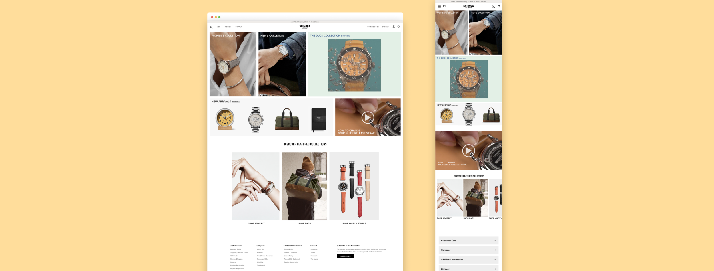
We successfully delivered the final design proposal in April 2020. There were certainly many more improvements we could have made before launch, but our team and Shinola supposed the idea of obtaining more data from the ongoing updates. Since April 2020, the site continuously went through multiple phases of changes. As of now, I am thrilled to see that how the current site setup validates conceptual elements from our final design proposal. [Link: Shinola.com]
Overview


Part 1: Discovery Research
Process
As we entered the renewal phase, our team gathered to spot pain points to better understand the site.
While Shinola was focusing on the target market of middle to high-class sophisticated millennials and their parents, we set our objectives to learn more about the current setup to narrow down the interview participants to meet the adequate target market.
User test
We conducted rapid user testings of 8 young adults between ages 20-24 and they pointed out the confusing navigation experience from the homepage.
Too much scrolling
—
While the hamburger menu was a space-saving mechanism, everything seemed hidden as the landing page was filled with big banners with endless scrolls and lacked a clear description of each collection with CTA.

Hidden navigation bar
—
Clicking the three stripes in the upper left corner of the website was the only user path to access the top-level pages of a site.
The navigation bar required one click and two big scrolls to glance at the full list of links. We set our urgent goal to embed navigation to enable customers to navigate within the website without extra cognitive loads.

Solution: Straightforward display of users’ needs
—
We suggested replacing the hamburger menu with a floating navigation bar that clearly displays the users’ needs, objectives, and content in mind in one view.

Part 2: Site Analysis
Heuristic analysis to spot opportunities for improvement
—
After the developer team made major design changes within the dev site, we were tasked with a heuristic analysis of the dev site using SWOT analysis to identify strengths, weaknesses, opportunities and threats for future site planning.
Strength
- Floating navigation bar displays user needs
- Our Story Page delivers the personality of the company and takes users to the Hotel and Journal—dedicated editorial hub
Weakness
- Customization feature is not accessible until checkout
- Must click on the product image to view more details
- Not mobile-friendly
- In-store experience does not show
Opportunities
- Use of multiple small banners to inform of different collections on the landing page
- Mobile-friendly responsive design
- Customization feature visible to increase personalization
- Horizontal scroll to preview product photos
Threats
- Color scheme may not represent the branding
- Added features may take away the current simplicity

Data analytics
—
Soon after we presented the analysis to the e-commerce team, the designated site release date fast approached. Shinola decided to launch and live test out the incorporated navigation bar and layout.
We worked with the Data team to gain insights on the landing page using Hotjar which instantly revealed what the problems were.

Key insights
—
1. Too big of one hero image
Statistically, 67% of users did not go past the hero image. Even when they stayed on top, the banner itself only got 1.5% of overall clicks.
While only 33% of customers scrolled past the banner, majority of them clicked on men’s collection.
I wanted to focus on 3 key features to be presented on the landing page:
Emphasis on Women and Men’s collections
Information on product personalization options
Replicate the immersive in-store experience

2. Understand customer potential
Discovering there were many more people browsing on mobile devices than desktops, having a responsive mobile-friendly design was necessary to bring more sales from our potential customers.
Desktop click-through rate 44.8%
Mobile click-through rate 75%
Part 3: Design Opportunities
The team gathered to list out what the landing page must include by performing competitors analysis. Our primary goal was to study common successful trends and achieve a higher conversion rate from the landing page for users to explore more products.
1. Iterating assumptions
To help users swiftly navigate through the context within the landing page, we highlighted three style guidelines that Shinola must fulfill:
Use smaller banners
Emphasize remaining collections
Bring the focal point to the top of the home page
To deliver the researched data into visual elements, I sketched and presented 3 conceptual developments of mid-fi screens to the director of e-commerce.
2. Design decision made with developers
Due to the current database structure at the time, the idea of showing “Our Favorites” from concept 1 was favored but not feasible. The development team needed more time to work on the database server in order to retrieve the corresponding information.
We agreed to incorporate the element from concept 1 in the near future and decided to move forward with concept 2’s smaller but highlighted banners.

Concept 1

Concept 2

Concept 3
3. Final Design Proposal: Allow users to easily explore more products
To resolve overly simplified banners after the renewal, I looked backwards to merge highlights from the contents before renewal. The presented layout provided the flexibility to further implement contents utilizing different types of photos or collections placement.
Design Focus
We believed a good landing page should be able to answer any initial questions the customer might have to improve customer conversion.
To bring customers’ attentions to various collections Shinola offered, we designed a stack of small but meaningful banners with brief descriptions.
Responsive Design
Proposed layout using a proportion-based grid helped rearrange content design elements when switching between mobile and desktop devices.


Takeaways
What I learned
The team had particularly strong experience with business and research as the project was through Ross School of Business. As a sole designer, support from teammates with business administration backgrounds helped leverage each others’ strength to approach problems in dynamic ways. Producing designs using business strategies such as business model canvas, value proposition canvas and SWOT analysis, I learned to widen my perspective to consider value factors such as trend, customer interest and market focus.
What I wanted to experiment with
Shinola aims to create a unique brand identity through creative in-store experiences rather than the traditional cut-and-paste approach. Well-communicated concepts in innovative shopping experiences retained many customers but those key factors were not reflected in the digital space. I wanted to bring the immersive experience from physical space into digital space.

“While being treated to a seriously satisfying and friendly shopping experience, it’s definitely worth checking out Shinola’s store.” -kris lavin
Key Focus
The signature brick wall along with the black shelf as a frame to showcase each product.
Attempt to blend in-store and digital experiences to provide a memorable brand experience for the customer.
The proposed idea was rejected due to its inability to make the design responsive to the mobile version.
I learned to consider the levels of importance when designing for e-commerce purposes. The more valuable aspect to consider was sustainability—how fast they can update.
Design decision-making should consider responsiveness and adaptability for the developers.
← Back
to Home
Next →
to REX ACADEMY