
🦖 Improving teacher-student communication
on the Student Dashboard
Over the span of 4 months, I had the chance to join Rex Academy, an interactive web-based learning management platform for students to learn computer science, as a UX design consultant on the Student Team. During my time, I got to explore ways to help improve communication with teachers across the platform while learning. The goal for my project was to help increase dashboard page scannability for students who were only focused on completing assignments.
DURATION
4 months contract
Mar - Jun
WORKED WITH
4 UX Designers, Curriculum Director, and Staff Developer
MY ROLE
I took the lead on the designs of the student dashboard page and built wireframes and prototypes to develop by the upcoming semester through collaborating with the curriculum director and software developer. And I also…
-
Conducted user research and usability testing to discover pain points and define problems.
--
Organized information architecture to streamline the navigation system.
- - -
Improved page scan-ability to deliver the information using Z-pattern layout.
What is the initial problem?
Students are only using the homepage to do their assignments
From an early stage of user interview and usability testing of the platform, we immediately discovered a common user behavior pattern: Students accessed the website to go straight to the applicable course page and left the platform.
Problem 1
Heavily goal-oriented layout:
Unaware of other features on the Dashboard
While most students only wanted to finish their homework and leave the platform, this oftentimes leaving them unaware of other features on the Dashboard.
Takeaways
→ The layout of the features was placed without a logical visual hierarchy.
→ Outdated visual design took away the overall learning experience.
→ More than 60% of students were unaware of existing features other than courses.
Problem 2
Unorganized information architecture makes the page difficult to navigate
After completing an assignment, students couldn’t go back to the previous page to continue their learning. Consistently facing end pages without clear CTA caused students to look for breadcrumbs or to restart the journey from the dashboard.

Takeaways
→ Despite there are main services within the platform, only the dashboard, calendar, and grades are listed on the navigation menu list. While taking courses, students were confused about their location within the site structure.
→ Unorganized information architecture created unclear site paths.
→ More than 70% of students showed frustration with the navigation system.
So, what’s the design goal?
Design the dashboard that facilitates seamless learning and communication with teachers
Students were missing updates from teachers because of unorganized information architecture which discouraged platform engagement and caused usability issues.
→ The goal was to make it as easy as possible for students to learn and communicate with teachers in one place at the dashboard.
Competitive analysis
Understanding market trends and what students are used to

Throughout the interview, 4 learning platforms were constantly mentioned by the students. I wanted to get insights on the interface structure, learning content, navigation experience, and personality of the content style. Therefore I learned…
1. Visual indicator on the navigation bar is very efficient in displaying location and can help people orient themselves on the site.
2. Platform needs consistent use of primary and secondary colors to increase branding and to add personality to the site.
3. Rex Academy needs to organize information architecture under categories to help students achieve clear communication with the teachers.
Qualitative research insights and takeaways allowed me to develop a perspective to approach problems from big systems to small elements.
The goal was to clear up the unorganized user flows in the platform to communicate with the teacher while accessing the course.
Ideation
Help students efficiently scan updates and study
I created a few sketches to apply concepts into Student Dashboard and developed mid-fidelity wireframes. Version 1 was to include an informational section above the scroll to help students grasp the updates from the teacher while taking the courses.
However, close collaboration with the developer helped us to think outside of the provided data. Although the majority of the current students take 1-3 courses per semester, it is possible to take as many as they desire up to 45 courses. I proposed version 2 to increase the scannability and allow flexibility when enrolled in multiple courses.
→ Mid-Fi Version 1
→ Mid-fi version 2
A/B test result: Improved Z-Pattern reading with version 2
I decided to A/B test both iterations through user observations and quickly discovered the text scanning pattern. As students naturally attempted to be efficient, the Z-pattern on version 2 delivered almost the same amount of information as reading, but with significantly less time and effort compared to version 1.
Moreover, students naturally scanned the dashboard before accessing the course addressed the goal by switching users’ focus from course to collaborative learning experience.
Final design
Refining dashboard from
course-centered to student-centered
After setting on a direction, my next step was to work with the curriculum director and developer to re-organize information architecture to ensure necessary features for students to be displayed with a logical hierarchy.
1) One global navigation
The previous navigation system had no branding, lacked focus and clarity, nor the menu list contained top-level services. I completely revamped it with an essential list of links in an order prioritized by students’ feedback.

→ Adding the location indicator that changes color from dark navy to light purple, the “you-are-here” signal is communicating and helping students to be more confident within the platform.
2) Improving readability with Color-code
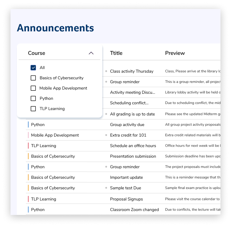
I focused on building the feature that students favored the most from user observation—students preferred to read less but still wanted to gaze at information. Color-code feature allows students to select and assign a color to the course, which would be synced to the announcement and calendar features.

→ The dashboard is designed to only show the most necessary content—highlighting upcoming calendar events and announcements encourages collaboration with teachers and peers. Gamification grows as students learn and engage through course progress.
3) Select to view or hide courses
Students can check the monthly views of course events posted by teachers, and can identify the courses by assigned colors.

4) Communicate and build a sense of connection
Announcements page allows students to view and comment on each announcement. This enables students to work in a collaborative environment and learns to appreciate the sense of connection with the teacher and classmates.

TESTING INSIGHTS
Dashboard that communicates
“ The announcements on top, the calendar, and then the experience, I think that’s awesome. It kind of checks off all the main marks that somebody needs to see for progression. ” – Participant S.
40%
↓
89%
found navigation comprehensive
29%
↓
100%
were able to locate what page they are on
42%
↓
92%
digested dashboard information instantly
40%
↓
98%
recognized top-level services before mentioned
Reflection

Optimizing a remote design experience
This was my first remote design experience. I was able to learn a lot about how to work together with teams, stakeholders, and younger users. Here are my highlighted stories of each!
Working with a client to understand pitfalls:
During the research presentation, the client expressed high confidence in having the gamification feature within their platform. However, from user testing, I recognized the pitfall of the gamification feature that points and badges were not sufficient enough to provide long-term rewards. Personally, I wanted to take it further to reinforce the understanding of what rewards mean to students, yet the team eventually did not have enough time to solve an answer to this question.
As an alternative solution, I decided to focus on bringing a pleasurable experience of growing together along with Rex Academy's character. While I was tasked with dashboard reinforcement, I devoted extra time to come up with the structure of growing, which became the principle of gamification feature development. The second usability testing not only validated increased interest and engagement from gamification but also stronger branding potential.
Working with younger users
Throughout the user interview process, I learned the importance of setting the right tone. During the first round of interviews, we struggled to spot the issue of instability to shorten the distance between the interviewer and the interviewee. Then, while listening to our transcripts from Otter, we realized the mistake of calling the interviewee, “kids”. We immediately changed our term to “students” for the second round of user interviews and began receiving personalized feedback from the users.
Working with teammates
While working as a team, there were moments when we got hung up on small details. Through constant communication and updates within the team, I learned to observe the project with a zoomed-out perspective to prioritize tasks and be flexible to make compromises. To stay on track with the timeline, our team received rigorous weekly mentorship from designers and researchers from ADP, JP Morgan, and Olo to gain insights.
Working with the developer
This project was my first project to hold constant thorough discussion with the developer. Being able to identify the possible bandwidth, I was able to work around and within the limitation.
As I delivered the developer handoff and it’s currently under development, I cannot wait to see this in action soon 🚀.